 Total Draw
Red, green and mud: fixing color mixing
How remembering an 11 year old MinutePhysics video sent me down a small but colorful rabbit hole.
I've been building Total Draw's blending tools: smudge, blend and blur. After getting them mostly working, I kept noticing this dark, brownish band right where the two colors meet.
And it reminded me of a video I watched a while ago: MinutePhysics' Computer Color is Broken. I highly recommend it if you haven't seen it. The gist is that most computer programs don't store how bright a pixel is, they store something closer to the square root of it. This is because our eyes are much better at telling dark shades apart than bright ones, so it's worth spending more of the 256 values (of regular "8-Bit" color) on the darks. That's great for storage, and it made a lot of sense back in the day. But when a program averages two of those stored numbers, it isn't averaging light, and the middle comes out too dark.
The real curve is a bit more involved than a square root (it's the sRGB curve), but the idea is the same:
// What most painting apps do: average the stored values.
mid = (red + green) / 2;

// What light does: decode, average, encode again
mid = encode((decode(red) + decode(green)) / 2);

// sRGB to linear light
float decode(float c) {
    // These constants are from the sRGB standard and are just a way of storing light into 8 bits
    return c <= 0.04045 ? c / 12.92 : pow((c + 0.055) / 1.055, 2.4);
}
// fun fact, the physics of linear mixing was described by Isaac Newton in Opticks (1704)!
Here's what that looks like in Total Draw before any of this: a red stroke at 50% opacity, then a green one at 50% over it.
Linear Light Mixing
The video's answer is to do the math in linear light: decode the colors, mix them, encode the result. Krita lets you create a document in a linear color space, and then everything in it (strokes, opacity, layers, blend modes) works on linear values. Here's the same test in Krita:
But those paint strokes are at 50%, and they look more like 25%. That's the main problem of "pure" linear light mixing: it's physically right, but it isn't how we see brightness / value. This means that while linear light fixes the mud, it breaks the feel. Ultimately, still looking a little bit wrong.
But even if linear light were perfect, I'd have to make a compromise somewhere.
A linear document (Krita's way) stores the pixels as linear values. Everything is consistent, every operation sees the same space, and layer opacity and blend modes come along for free. So why not just do that for Total Draw. Here are some problems with that:
- 8 bits isn't enough for linear. Linear values spend most of their 256 steps on the highlights, so dark gradients band. You really want 16-bit or floating point, which doubles (or quadruples!) memory and file size.
- My file format would have to change. Total Draw stores layers as 64-pixel tiles compressed with QOI, which is 8-bit only. Part of why files are tiny and why they load quickly.
- The look is baked into the document. Changing your mind later means converting the whole painting.
The third option: mix the way we see
To my surprise, there's already a color space built for exactly this! It's called OKLab, made by Björn Ottosson in 2020. It takes a perceptual approach, equal steps look like equal steps, the way the stored sRGB values roughly do, so opacity and soft edges keep the feel we expect from painting apps. But it still mixes hues cleanly, so red into green passes through orange and yellow instead of brownish/gray. It's also what CSS's color-mix() uses by default now.
For Total Draw, my solution is to convert to OKLab's mixing space on the fly and then convert back when the result is written. This fixes most of the issues I've been discussing, but it does have a few big costs.
Namely, brush strokes are more computationally expensive: about twice as much, from about 1ms to 2ms for a stroke across a 4k canvas on my machine. (Smudge, blend and blur already did their mixing in shaders, so they didn't get any slower.) That isn't a ton in absolute terms, but I've put in a lot of effort making the painting feel smooth.
Also, layer opacity and blend modes need to stay the classic way for now, as those are recomputed every time a document is shown or exported, and so if someone changed it on their screen it would still look different on someone else's. My potential solution there would be to bake that into the file format, but that comes with its own issues of usability, but it might end up being the direction I take.
I call these two modes Perceptual, and Classic; and I added a toggle in "Settings → Color mixing" to switch between them. I kept Classic in case people prefer the old feel, but Perceptual is the default.
How it works
Converting a color to OKLab is two small matrix multiplies with a cube root in between. In the shaders it looks like this (trimmed a bit):
float3 linear_to_oklab(float3 c) {
    // `M1` and `M2` are the matrices that Ottosson originally described in his post.

    float3 lms = mul(M1, c);                // linear sRGB to cone-like responses
    lms = pow(max(lms, 0.0), 1.0 / 3.0);    // the cube root: where "perceptual" comes from
    return mul(M2, lms);                    // to L (lightness), a, b
}
Brush strokes were a little difficult to get this working. Normally, the GPU creates the stroke on the canvas with its built-in blending, which is fast and can only do simple sums. So in Perceptual mode, a stroke goes through a shader that reads a copy of the tile (Total Draw uses 64x64 tiles to represent the canvas, only manipulating the tiles that have been used for each layer) before doing the blend. Maybe eventually GPUs will add hardware capabilities for perceptual blending!
Blending
Here is a comparison of the old "Classic" option and the new "Perceptual" one:
And the same thing with the plain Blur tool, run down a red and green edge:
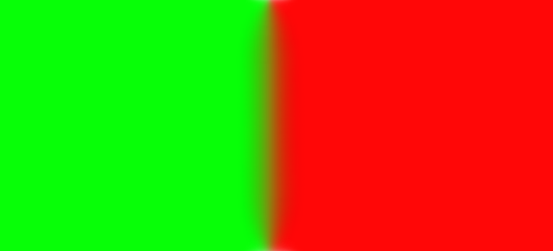
Classic
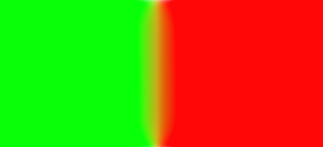
Perceptual
It is a relatively small thing all things considered, but as Minute Physics says, "shouldn't beauty be the default?"
What's next
- Perceptual layers. Layer opacity and blend modes are still in classic-mode. Making those perceptual has to be a setting saved with each document, which means baking it into the file format, and converting older files when they're opened.
- Fills. The bucket fill and Fill Selection still mix their soft edges the classic way, since they run on the CPU.
- Paint that mixes like paint. OKLab mixes like light does, just tuned to our senses. With real paint, mixing red and green creates a brownish orange color, not yellow. But ideally we'd have some sort of way to emulate "subtractive" color mixing instead of the "additive" of digital displays. Not sure if I'll ever tackle that one with Total Draw though.
If you are in the Alpha, try it out, and let me know what you think!
Thank you!